71robert13's Blog
Recolor Poll Results
Poll # 1: 102 participants
Question: Do you recolor items you have downloaded? Yes: 31% No: 69%
Question: What program do you use? Windows/Mac paint: 4%
Other Free Program: 7%
Photoshop: 27%
Other Purchased Program: 6%
None (I don't recolor): 50%
( I'm surprised I thought more people did do recolors at least for personal use. Dose this also mean that there is a 50/50 proportion of artists / non-artists as a whole using this web site???) I use Photoshop pro but was debating on purchasing "Eyecandy" (which looks totally awesome but is expensive), Not 1 person surveyed uses it so I guess it's not worth the $, I'll stick to what I have.
Question: Do you Prefer: separate mesh with multiple individual recolor file options: 23%
All in 1 file: Mesh and multiple color options: 69%
(Cool, that's how I like doing them. recolor packages are good too but more than 1 option per file helps keep the file list small.)
Question: Which is more critical to you: Low memory usage (Less detailed - refined textures): 25%
High quality detailed textures (requires more memory): 72%
(Cool, I definitely prefer doing quality work. Although I also try to keep memory in mind, quality always wins out for me.)
Mostly that question was posted to determine whether or not I should use raw 24 / 32 or DXT1,2, or 3 for the image format in SimPE. Raw gives much better quality but the DXT options reduce memory)
Question: what do you think of the texture repository method (AKA: Master/Slave mesh system):
I Love it: 25% (x4 pnts) = 100 pnts
I Like it: 17% (x2 pnt) = 34 pnts
it's OK: 45% (x1) = 45 pnts
I don't like it: 6% (x2 pnt) = 12 pnts
I Hate it: 2% (x4 pnts) = 8 pnts
Positive: 134 points Neutral: 45 points Negative: 20 points
Overwhelmingly in favor of the master / slave system :( (personally I don't like it for most applications)
The NewWalls System
The NewWalls System
By: 71robert13
SKS
Introduction
Which do you need
What it is
The choice revolution
Magic!
Pre-trimmed wallpapers
Final notes
Introduction:
Welcome to the NewWalls System, a totally revolutionary way of decorating your walls! Keep in mind that as of this day: 4-16-10 I have only uploaded the basic set and many more options are on their way. I have planed at least 2 more complete set and several special individual additions so keep checking back to expand your collection.
Which do you need:
I have (and will continue for the new additions) to upload “duplicate” items. They will be designated as Basic or MGAL. The difference is only in how they are cataloged.
For those who have either Mansions & Garden stuff or Apartment Life Expansion (or both) you have a catalog option that is otherwise unavailable: Build mode / Construction / Architecture.
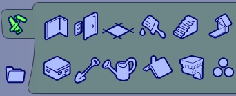
It is designated by an ionic bracket located 2nd from right on the bottom row. This catalog section is relatively empty as only those 2 packs use it and it allows for repeated purchasing (you don’t have to select for every piece) These factors makes this cataloging preferable, however even with these added packs you may choose to use the basic sets. If you don’t have either one or the other MGAL designated items will not show up in your catalog - USE BASIC SETs.
Basic sets are cataloged under Buy Mode / Decorative / Miscellaneous,

which is already rather congested with numerous items but the base game dose not really have any other viable options. With these sets I strongly recommend setting up a collection folder to help keep all your NewWalls objects together & easy to find. Basic set is also available by room sort and community sort under “Other”.
Personal note: I really like Mansions & Garden stuff and recommend getting it if you haven’t already. Most of the stuff packs I don’t think are worth the expense but this one is. (My opinion only of course)
What it is:
The NewWalls System is a collection of trims, moldings and wainscot add-ons. They can be used on almost all Maxis wall coverings as well as most standard formatted custom walls. However it is best used with 4 way tileable wall patterns (Generally: any that do not have trim already pained on). This type of wall pattern allows for wonderful design possibilities when constructing multi storied walls, overhanging balconies an the like because the uninterrupted portion of the wall can have a seamless pattern trimmed only where it should be.
NewWalls trimmings are also 3D meshed allowing better visuals achieved by natural highlights & shadows. Another advantage to the 3D mesh trimmings over the standard flat painted ones is seen at wall edges such as corners and terminal ends. Because NewWalls trim is 3D it adds shape, volume & dimension in these areas. Far more realistic! A complete set will include Crown molding, Chair rail, Wainscot, & baseboard. Each of these have the primary form, an outside corner and an end cap for terminal walls. The baseboard, Chair rail & wainscot also has left and right stair angles.: See “ Magic” section below.
For those who are mesh conscious: I do endeavor to minimize my vertices and planes as much as possible without having to be excessive on the size of the texture file or sacrificing form. A wainscot panel for example only has 2 faces & 4 vertices.
The choice Revolution:

Here is a page from my in-game walls catalog showing a variety of wall papers, the “Gratuitous” wallpaper set is highlighted as this set is what I will use in the following examples. As you already know (and can see in the illustration) with the original system you have 1 catalog entry for every option.

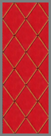
The “Gratuitous” Wallpaper set has 1 solid 4 way tileable and 6 available variables for a total of 7 entries and 7 options. This creates excessively burdensome catalogs while providing very little choice.
For use with the NewWalls System we only need to have the 4 way tile basic pattern. And our NewWalls catalog entries.:

These are the entries for base game Standard set (the one currently available) This set has 18 catalog entries (which will be common for all complete sets). In this set each form comes with 11 texture options. With this setup we get 78+ Options!
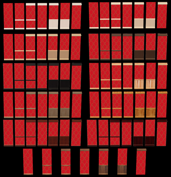
77 trim options, still retaining the untrimmed option, + stair angles (see magic section below). That’s 78+ choices for each & every base 4way tileable wall pattern. 10 4way walls gives 780+ design choices, Add another NewWalls Set (if it also has 11 textures) & 10 walls your available choices would be 1560 for a total catalog load of 46 entries! And that’s only calculating all matching textures (Like all white or all oak), But with this system you can mix textures a white baseboard & rail with oak wainscot etc. Base game comes with 57+ 4way tileable wall patterns. When this project is completed the number of design options will be virtually unlimited.
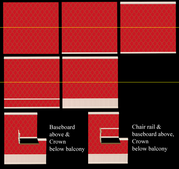
Here are some examples of 2 story wall layouts possible trough use of the NewWall system that would not be possible with standard method (atleast not without a whole lot of wall files!).
Magic!
Try this with standard wall technique!
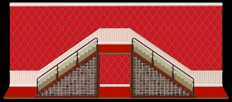
Yea right, like that’s possible. But it is with the NewWall systems left & right stair angle pieces.
It’s magic! Now you can smoothly transition your walls from floor to floor. Yet another advantage to using the NewWall System.
Pre-Trimmed Wallpapers
You can overlay NewWalls components to most pre-trimmed wall patterns. However the standard Baseboard dose not completely cover painted on wide baseboards (ie.: “Gratuitous“ wallpaper with kick molding has a wide baseboard). (The baseboard from my next set will). NewWalls units also don’t work well with panel formatted walls (ie.: “Frank Lee Scarlet” Paneling), or most walls that have boarders (ie.: “Hopalong” boarder on…). This system also is not well applied to special wall patterns (Ie.: “Churning Energy” or “the Happy little pattern” in …). The best wall patterns to use are un trimmed 4way tileable wall patterns.
Final notes
I have used the “texture repository system” here. With the standard set you must have the baseboard (master) in order to have the chair rail (slave). Crown & wainscot have their own textures.
For a full selection of currently available NewWalls pieces enter NewWalls into the search box on TSR
Searching 4way will show my selection of currently available 4way tileable wallpapers.
As of 4-16-10 I have only the standard sets. Other sets & special add-ons will be available soon.
Artists:
Anyone wishing to add to the NewWalls collection with creations of their own are free to do so but please give me credit for concept / inspiration as the initial creator of the NewWall system.
Wallpaper artists are encouraged to add “4way” to their keywords list if it applies to their wall pattern.
Downloaders:
All genuine SKS items bear my SKS logo.
Thank you for reading this posting and your interest in the NewWall System. Have fun & Play well.
SKS
Wallpaper distortion
Some people may notice some distortion with the wallpapers they download (not just mine but any). Here's the issue: Apartment Life expansion pack: This expansion pack altered the hight of walls by a fair amount and the game mearly stretches wallpaper files to fit the new dimension. The result is a circle made to be a circle on a 256x512 template or from any ealier EA release becomes an oval, a square is now a vertical rectangle.
This can be compensated for in the creation proccess: start with an oversized image and shrink it on the vertical by 70%. This will look like a sqat oval or horizontal recatagle in your image editor. Be sure to still fill the entire 512 pixel hight. Once imported it will be stretched back into the proper shape.
Basicly for proper shaping in Apartment Life you should use a 256 x 732 pixel template then reduce the hight 30% to 256 x 512 & then import it with homecrafter.
Problem with doing this: Anyone useing that pattern who dose not have Apartment Life will see it as being squished.
Best solution: Comprimise: Granted no body will have a perfect circle /everyone will have some distortion but it won't be tragicly noticable to anyone. 85% is the perfect middle (256 x 603 pixel original shrunk down 15% to 256 x 512 & imported). Viola! Everybody's happy!
Another issue with wallpapers I've noticed is with the crown molding, Especialy if your designing a detailed crown. Any crown looks great in normal mode, but in screen shots, video or any viewing with where the cieling is applied, crowns get buried in the cieling. Basicly the cieling covers the top 24 pixel rows. Solution: Use a 24 pixel high header on your crown, any critical detailing should be below the 24th row. This, I believe, applies to games with or without Apartment Life expansion.
Have fun & play well,
SKS
Monitor type & color quality
There is a huge difference between monitor types and how they reproduce color. When I started with Sims 2 I was frequently upset because things were way to dark, almost black and compleatly lacked detail. I didn't realize the problem was a difference between monitors. I was using a CRT (cathode Ray Tube: large, bulky heavy, old type) and those very dark objects & clothing were generated by people using an LCD (Liquid Crystal Display: thin, light, new type). My earlier creations were made using the CRT monitor, Inevitably they appear comparatively light and washed out to people seeing them on an LCD monitor. Now (& for the last several months) I have been using an LCD monitor for making my creations, & they of course look very dark on my CRT. The differnce is quite noticable with my latest upload of empire damask wallpaper with laurel wreath wainscot in cherrywood. To those still using CRT monitors: you can barely see the dentil work or the wood grain, sorry. The cherry wood parts are realy well textured and wonderfuly rich in detail.
There really is no easy solution. You can get an LCD monitor, but all the creations made on a CRT will look pale (And so will everything else, Even my black desktop background just isn't a true black). I really hated my new monitor when I got it. I did learn one trick to make colors look a bit richer & Deeper: Tilt the screen back, don't use it perpendicular to your line of sight. But still the color representation just isn't what it was with a CRT.
Anyway I just thought I'd put this info out for any of you who might be frustrated and don't know why people are creating things that are crazy dark or pale & washed out. I'm sure evey artist, as well as myself, are creating things with great color, texture, & detail. It's just based on the monitor type they are using which may not be the same as the one you have. You can generaly tell by the preview image, what monitor type was used & how it will look in the game with your monitor, but not always.
Have fun & play well,
SKS
Clothing File naming system
Hi everybody, I just thought I ought to write up a detail about my file naming system to clairify it for those who are kind enough to download my stuff. If you are new to the game or just starting out making your own stuff you might find it helpfull to adopt the system or something like it.
Example:
885069_AMB_SKS_Baggy_Studs-Red
Can be broken down as:
xxxxxx_123_SKS_Mesh shape_item general description-specifyer (Usually color)
xxxxxx = 6 digit random number assigned by Body Shop in the item creation process. on my computer I always move this number to the back, but TSR wants it in front (its original position) for submissions.
1 = Age as follows; A=Adult, C=Child, D=toDdler, E=Elder, T=Teen
2=Sex as follows; F=Female, M=Male
3=Type as follows; B=Bottom only (Pants), BS= Bottom only (Shorts), T=Top only, F=Full outfit (Everyday), FF=Full Formal wear, U=Underwear, PJ=Sleepwear, Swim=Swimwear, WO=Workout, O=Outerwear
Mesh shape is basic but gives you an idea of what mesh it goes to in this case "Baggy" = Mesh_AMB_SKS_Loosfit_Sneakers
Item general description: on this mesh there are several styles applyed so Studs refers to the pants with studded straps
Specifyer: Almost always a color that designates it from other similar items
Thus: TMT_Nude_Net-Gold would be: teen, Male, Top_ Nude fit mesh_Net style shirt- in a gold color.
I Find this system works extremely well when trying to find the right file for a specific item. If I know what the item looks like I can generally find the file without any problems.
NOTE: If you are starting to create items and you want to put in an artist name it works best if it is either short (like SKS) or if you put it at the back of the file name. Files with long artist names up front are difficult to fish through and I (& Probably most people) end up abbreviating it or simply deleting it.







 Limited Time Offer
 For a limited time only, we’re giving away a free


