


The New TSR
I wrote this comment in response to the developers' request for feedback on the new site:
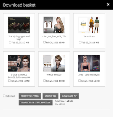
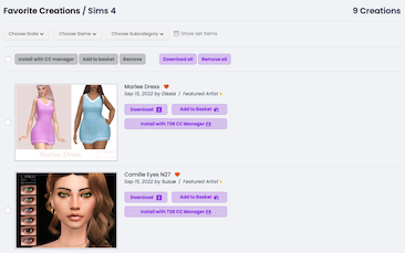
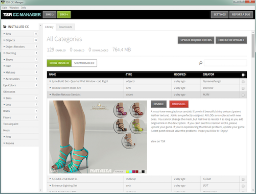
"My first impression? I hate it. Sure it's shiny, but if you were aiming to make it easier for people to find things, you have failed. It's harder than ever to locate a specific item on the front page. Haven't you guys heard of the old saying "less is more" ? You have so much information in such a small space, the images keep getting smaller and smaller and the numerous pods are ridiculously undersized. Give people the option to remove the pods that they never intend to use (both on the front page and on their profile pages), and don't make it so hard to figure out how to remove them. Accessing profile pages, forums, private messages, live chat, submission areas and the download database should only take one click. The best websites are the ones that don't require you to spend 30 minutes looking for or doing one small thing."
Maybe I'll get used to it, but I have to say ... I'm not really happy about it.


 Limited Time Offer
 For a limited time only, we’re giving away a free


